

FEATURE
“The unprinted space has its own presence.”
Artist Lucy Annan discusses architecture, light and discarded objects in her exhibition Peripheral Vision at HAUSPRINT with fellow artist Chris Christodoulou.
Chris Christodoulou: I’m Chris, I’m an architect and printmaker. I’ve known Lucy for 10, 15 years, since we both studied printmaking at Morley College. That’s where we started our association, and we’ve been seeing each other’s work grow and develop since then. I’m very pleased to be able to present Lucy’s new exhibition because we share a common thread.
Lucy Annan: I wanted to introduce Chris back to you, which was just to say that I knew his work long before I knew him, because I went to his MA at Chelsea College of Art, where he did a very good, very powerful installation to do with the green line in Cyprus. I was quite surprised when I got to meet him at Morley College.
CC: We do share an architectural aesthetic but we present it in a different way. And it’ll be interesting to see what you think as we carry on the dialogue. Lucy, can you give us a brief background on yourself or those who don’t know you so well?
LA: Maybe the architects that are here are going to find that I talk about a lot of stuff that they all know already, but I trained as an architect, and it’s had a huge influence on my printmaking. I came here via Morley College, where I went to classes one day a week while I was still working at Marks Barfield architects, who were the creators of the London Eye.
One of the things I noticed was that there were quite a lot of other architects doing the printmaking course. It made me think that there’s a very strong link between print and architecture, and for me, printmaking spans, or leaps the gap between three dimensions and two dimensions without passing through painting at all. That’s to do with the way that plates have a three dimensional contact with the paper.
Also with my background, I think of architectural drawing – which is one of the things that I use in my prints – as being analogous to music really, that a good musician can look at a score and read the music in their heads. Architects look at flat plans and turn them into volumes in their head, so you can read space through 2D drawings.
I use architectural conventions like plans and elevations and sections in my work, without them being too literal, and they also illustrate a sense of place and time as well as just architectural space. The images are not literal images. They allow the viewer to translate them for themselves a bit and project their own interpretations on them.
I love it when people see completely different things in my work to what I see myself.
CC: A bit like imaginary landscapes and cityscapes.
LA: Well that’s what I see, but other people tell me they see completely different things.
One of the other big influences in my life, after leaving a course in theatre design at Wimbledon School of Art, was when I found myself working as a dog’s body at Foster Associates, which is now Foster and Partners. At that stage it was a young and dynamic office with about 25 people in it, and I instantly realised that architecture was what I wanted to study.
I’d never had much encouragement in that direction at school, but working at Foster opened my eyes to a whole new way of making buildings. It was in contrast to the most recent past, which was heavy, brutalist architecture. Their aesthetic was always referred to as a “kit of parts”. It was lightweight pieces put together in very elegant ways, and I just thought that great care went into making the parts and the connections of the pieces that were put together. They were things of great beauty in terms of that process, that methodology.
CC: Do you find that’s transferred into the way that you make prints?
LA: It does, but it’s not particularly well illustrated by this particular set of work. I do collect things and then I arrange them in ways on a page like a sort of “kit of parts”.
CC: A bit like collage… I am going to take a little leap now and mention the lockdowns during COVID-19. Lockdown affected everyone in different ways and is a kind of seminal period in our lives. Lucy, can you tell us how you got through that strange period?
LA: Well, I think I’m sorry to say rather too happily. When I knew lockdown was coming I panic-bought a very small press so that I could keep going. So that was really helpful for giving me something to do. And the other thing was the first one was beautiful spring weather, there was no pollution. You could smell the spring. There were no airplanes overhead to wake you up, and as we live under a flight path, that was quite important. It was sort of really a glorious time for us, because we had no children to home-school and no one that was ill. But I was painfully aware that other people were having the most horrible time.
CC: I like the fact that you panic-bought a press. This is at the same time people were panic-buying toilet paper. I was panic-drawing, you know, drawing as much as I could before Armageddon, so it’s interesting how we all reacted.
LA: The catalyst for some of this work was that with the brand-new press that I bought, I started a series of postcards. The first set I did were all black – I have only two left. But I did a huge range of cards from two plates, I think I did about 110 of them, and I sent them to all the people I couldn’t see.
Then the second lockdown was not nearly so much fun, because I think we were all sick of it by then, and it was dismal weather and everything was horrible. I did a whole lot more postcards. This time it was a bit like the “kit of parts”. I used things that I found, bits of old carpet underlay, shopping bags, a huge range of materials. I sent them all out to people.
Jenny once suggested I should hold a party after lockdown, to which people would only be allowed to come if they had kept their postcard.
CC: I think you’re making very little of this. I think the whole idea of you using your art to reach out to people you couldn’t see is a powerful statement.
LA: Yes, I think it was important, and on the back of these ones, I printed a little hand waving, because it was a visual sort of joke. It was the second wave of COVID, and it was the second wave to all the people I couldn’t see.
CC: I hope everyone kept those cards; they’ll be worth millions.
LA: One of the things that appeared in those ones was a Kentucky Fried Chicken box, which I picked up off the street. I’ve always been on the lookout for things that might be interesting in gutters and so on.
CC: Apparently, fast food became very popular during lockdown, and these effectively started you on a journey, didn’t they, in some way?
LA: I think it was the idea of picking up a small group of objects and then using them in lots of different ways to make a series of prints that were linked but not the same. That describes all the Field series that are in this exhibition.
They started out with one simple wooden block, which was square, and it was made of very, very poor quality veneer, and I chipped away at it with a design, a very simple drawing in a sketchbook, of fields that I’d done that was from a vantage point. It was part looking down in plan, and part like a tilted elevation. I carved that, and then I printed all the blocks in different colours and rotated them so you had a whole series of underneaths that were different colours and different orientations.
I like using a square because it gives me a chance to get four different orthogonal views using the same basic thing. Then I over-printed them with colour, sometimes not to the edge of the square, so some of them have ragged edges, and then once the different colour combinations and the different orientations had all been printed, they began to get a life of their own, and I could go off on tangents, printing more bits or adding pieces of collage.
The collage part was quite interesting. It’s the first time I’ve ever done it, and I found that I couldn’t really use bought coloured paper. Somehow the colours were always all wrong, so I printed all my own colours.
CC: Were they monoprinted?
LA: They were just sheets, really. I printed sheets of colour, and then I would cut bits out of them and stuck them on. But it was in order to make the colours seem as though they belonged to that family.
And this series is still going. I printed so many base sheets that I’m still working through the last of them.
CC: How did these evolve into the Aqaba landscapes? Or those are separate?

LA: They were completely separate. The Aqaba series was interrupted by lockdown and really came first. I was already thinking about using different colours and varying the print a bit, but those are less adventurous about setting off in different directions.
They’re much more like a series of prints that are based on another aspect that I incorporate in my work – the idea of light and shadow, and that was to do with very, very bright light in a desert being seen through a sort of fissure in a rock.

CC: I’m going to quote something you wrote, saying, “Aqaba, bright light of the desert, seen through a crack in a rock tunnel.”
LA: The only other colours that I used in the collage were some very select pieces that I cut out of newspapers, usually the centre page spread of The Guardian, which was some photographic thing, but otherwise, the colours have all been been chosen by me.
CC: And the square ones are still evolving?
LA: I’ve still got a few to finish. Yes.
CC: Do you make them like a lino cut reduction, and then paste over?
LA: The Aqaba ones, the rock face, are the equivalent of a lino cut reduction – they’re a woodblock reduction. They work from the centre outwards, in that the first colour is the very pale one, which is the bright light through the rock. And then gradually they work to the dark shades on either side. Whereas the lockdown ones took off in different directions at a much earlier stage.
CC: I’d like to touch on the point that one of the most important aspects of your work is this interrelationship of architecture in the printmaking. I’ve seen it quite clearly from your early Morley days, and it’s developed with the folded, geometric colour monotypes to some of the prints we can see here and more recently the etching year. Can you expand on that and tell us more?
LA: Perhaps I’ll start with a bit about what was powerful for me in my architectural education, which was very influential and still is, really. I was at the Central London Polytechnic, and the first year was what I now realise was a very, very traditional, sort of Bauhaus first year, and I just found it completely compelling and so exciting.
I worked so hard without stopping – it was wonderful, it really was it. It started, funnily enough, with the “kit of parts” that I’d been introduced to at Foster Associates, because our first project was to design and then build a shelter, a full size shelter, in the courtyard, made of only three materials – brown paper that we oiled, string and flexible timbers. It was a very good initiation into how to put things together.
Also it was quite interesting to see which people on the course were really keen and enthusiastic and worked really hard, and who were total skivvers, who couldn’t be bothered to come and put things up.
The other thing that was a strange introduction there, was that one of the members of staff had had printed, and various members of staff were buying, an entire set of the Nolli plan, which is an 18th century plan of Rome. It prints all the buildings dark, and all the open spaces white, and all the very important public buildings beautifully drawn in plan, and that was an enormous influence on how I place things on a sheet of paper.
It’s to do with the balance between the black and the white in etching and allowing the white unprinted parts of the paper to have a volume of their own. That’s important, that the unprinted space has its own presence.
CC: I’ve always looked at your work with a slight bit of envy and I think the connection between architecture and printmaking is so much more evident in your work than in mine. I’m drawn to it I think, because probably if I wasn’t doing my kind of crazy, autobiographical, kind of therapy drawings it’s an aspect I would love to be able to explore and go down that route. When I see you doing that, I think, oh yeah, that’s what I’d be doing if I wasn’t doing this crazy stuff. I’m giving you a kind of backward compliment somehow!
LA: Well there were other things that I was introduced to about the Bauhaus that set off these sorts of things. Like I tried to make a three-dimensional model of one of Josef Albers’ illusionistic, impossible to read Escher-like drawings, but simpler. I made this three-dimensional model out of an illusionistic drawing, and it ended up looking rather like a block of flats.
CC: You get some lovely images of blocks of flats, you know, something quiet, you know, ghostly.
LA: Oh these weren’t ghostly. They were quite angular. They had real depth to them. I think I’ve still got the model in a box somewhere, and when we move house, I think it will have to bite the dust.
I have some examples of where I’ve tried to use print and three dimensional work to complement each other. And on the whole, the concepts are not very complex in themselves. The first one I made was black on one side and red on the other. So it’s a very, very simple format. It’s called a Leporello, and all I have done is to slice the paper and bend them out in the opposite direction to make the zigzags, so from each side, you get a glimpse of the colour of the other side.

Then in Tricolour I threaded two different leporellos of different heights together, and sliced out some little windows to leave bits of it white. These were really simply a response to some rather dreary prints I made, and I decided I would do something with them. It turned what was not really interesting enough into something extremely interesting.

CC: If you cast direct light onto these objects the shadows that are created become another dimension, don’t they?
LA: Yes, I made one in response to a call out from the V&A called “Inspired By” influenced by an object in the museum. My starting point was very weird. I was interested in the idea of using a single sheet of paper to make something three dimensional. The object I chose to be my inspiration was a fire grate, which was a cast iron square that was sliced and bent in such a way as to make a log shaped depression in the middle, and it stood up on its own. I started making rough paper models and I have a box of hundreds of them.
CC: So if we can imagine an artist drawing, sketching, these would be like the 3d sketches for Lucy as she develops and thinks about something. They show a very interesting way in which an artist thinks. These maquettes I quite like in some way, sometimes more than the actual finished piece as they have a life of their own.
LA: What happened with these is I was busy making things, from my dingy studio in Brixton, which had a fabulous non-view of a completely solid wall of a high rise building not very far away, and suddenly a shaft of light came through, which lasted only for about five minutes, and it lit up the model on the table, and it cast these amazing diagonal shadows. Then I knew exactly what I had to print.
I printed the diagonals on the covers of this pop-up book, which were actually drawn from the shadows themselves so all the flat parts are images of the shadow that this 3D shape cast.

CC: It’s an amazing interrelation between real, physical and the under layer.
LA: Sometimes it’s quite complicated but others are more simple.
Audience: Where does this rather interesting name come from?
LA: It comes from Don Giovanni. In the opera, Leporello is Don Giovanni’s manservant and he keeps a list of his master’s conquests, which is so long that he has to fold the paper to fit it on a single page, so it’s an infinite list of women.
CC: You recently did an etching year at HAUSPRINT?
LA: Yes, almost a year of an evening class once a week. I thought I would try and reacquaint myself with etching, because I’d rather lost touch with it, and I’ve also had quite ambivalent feelings about it, because it always seems incredibly fiddly and process driven. So I wanted to learn all these techniques, some of which I knew anyway, but learn new ones as well, and then decide what it was I wanted to say with the techniques that I’d learned, rather than just being for their own sake.
During the year I found working on a plate very, very restricting, so I was very keen to break out of the small, very regular square. So I was working on plates simultaneously, but I started nibbling at the edges, and then I got braver and started taking great chunks out of the plates. And once I’d done that, I started to think about what happened beyond the edges of the plate.
They form a hint of a peripheral vision, which is the title of this exhibition, and what these prints are about. You’re focusing on the plate, but there are other things going on all around, that are part of what you feel or see or imagine in this landscape that I’ve created.


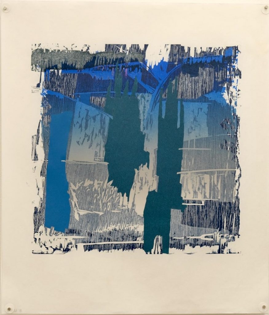
Sète, Nubian and Fortress Lucy Annan
It goes back to my thoughts about architecture and how we experience space. Everybody experiences space in totally different ways, and the longer you think about it, the more you realise that people have very different ways of interpreting where they are and what they’re feeling. All these pieces have their roots in imaginary buildings, or cityscapes, or landscapes and the bits that are beyond them are described in either the pale printed ink or in the blind emboss, which is where the paper is squashed, but without any ink on the plate at all.
CC: Looking at what you’ve done here, I like the fact that you’ve used etching in a way to state what you want to say with it. To explore architectural themes, for instance, in the way that you are using the plans and elevations to generate another type of image which suggests maybe a cityscape or a kind of interior landscape. But like you said, it’s beyond the border, isn’t it? It opens up the possibility. And you’ve used emboss, so they have a three dimensional feel as well.
LA: Well, that’s what I hope. I think I was quite pleased somebody came and looked at them, who has no visual background at all, he’s a writer and a poet, and he was quite excited by them. He said they reminded him of poetry, because there was a lot that was left to the imagination. I thought that was quite a nice thing to say.
CC: There is one called Borderland, that’s right, not Hinterland?
LA: No, Borderland. The others have a hinterland. But that one is Borderland, and it’s called that because it comes directly from a World War Two bunker, and that bunker is situated on the coast in Sussex, and it’s built out of the shingle on which it sits. It was made by using in-situ form work, I think. I made drawings there and you can see shapes in the work that clearly evoke the bunker.
I was in the bunker about this time of year (November), and it was brilliant, brilliant sunshine and freezing cold, and the sunlight came through the slots that the machine gun went through and it lit up parts of the floor and the machine gun tables, creating bright patches of light.

In a way the piece describes the space where you’re not focusing. The focus space is the square on the left, and the end of the space is the black shape on the right, but the space in between is the bit you’re not focusing on.
CC: It’s kind of a play on void and mass.
LA: Exactly, it’s figure/ground, or what I was talking about with the Nolli plan. Then there are things you can see through the slots. That is how I explain it. It’s part view, part plan, part on the edges and part Nolli plan. So it’s using quite a lot of different techniques that I’ve used throughout my work.
CC: It’s good to see that you’ve made it your own. You’ve taken the etching process and used it to explore things that matter to you.
LA: That was the thing that I hadn’t got up until then, although I have to say there’s some fantastic stuff happening at Morley College, and I learned an enormous amount. The real joy was working right at the beginning of my time there. My tutor was Dorothea Wight, and then she became very ill, and her husband Marc Balakjian took over her role. They were the people who printed all Lucien Freud‘s and Frank Auerbach‘s work. They were really incredible people to be taught by. I just didn’t really get the point of how to use etching, although I’d been taught what to do.
CC: The other thing you’re keen on is working with discarded materials. Is that something that’s evolved over time?
LA: It has, and it started very early on. I have a trio of prints called Nets, that are actually made out of a shopping bag and some packaging that I cut into shapes in order to print them. I don’t know how I started off with the shopping bag, but I’d done quite a lot of work before with found things before.

The first thing, which I got very excited about, was a very large disc which I found on the beach. The disc was perforated, and it was quite scratched and damaged. I thought it’d be great to print this, so I did, and then I thought about how it would be if the sea really began to destroy it. Then I started to destroy it myself, and hacked great bits out of it, and gradually sawed it into pieces. And the arrangements started to fly off the page. That was my first attempt at printing with old rubbish.
Another series I did was with gloves that I found washed up on the beach, and most of them were very heavy workman-like gloves. So I actually inked the gloves and printed them onto Japanese paper, which is very sensitive to every little bit of ink. Dark and light.
Because on the whole the gloves were big and masculine, they were slightly menacing, and they all seemed very large. And while that was happening, providence placed the most beautiful leather glove in the gutter outside my house. It sort of flew in. And it was lovely to print it because it was small and delicate, and it had those tiny little flaws that you get in the hide. I just inked it up in different ways, and I could get it fluttering across the page like a bat. There were lots of ways I used these gloves.
CC: I think you were having a lot of fun. In a way there’s no reason to be precious. You can just go for it. There’s no sense of “what if it’s wrong?” or whatever. To hell with that. I like the fact that you were exploring different ways to convey certain messages.
LA: They were just a joy to do. I actually sent a whole group of those prints off to a French exhibition. When I went to the opening of the exhibition, somebody started talking to me about how I made them, and she was absolutely appalled that I hadn’t drawn them. She was really shocked, and she implied that they weren’t really worth anything, because I hadn’t bothered to make them myself. Because it was a rather conventional etching type of show, they expected everything to be done the way they did it.
The process is that I place a piece of newsprint on the press, and I ink up the glove and place it on the newsprint. Then I put a piece of printing paper on top, with lots of tissue paper on top of that, so that the ink doesn’t ooze out into the blankets or the press. And then I roll it through.
But that was why the French woman didn’t think that these gloves were worth bothering with, because she thought I hadn’t put enough hours into them. I had put plenty hours in but I hadn’t actually physically drawn every little part, that’s what it was. It was a readymade. It was that the gloves made the print. And she thought that was a cheat, but it was too late. They were in the exhibition by then.
CC: You reinterpreted it in your way to give it some other life, you don’t have to draw everything.
LA: I was thinking of gloves as bats or gloves as menacing hands coming at you with thick, fat fingers.
CC: I’m listening to you now, and I can see you’re inspired. You’ve got this enthusiasm each time you explore something it leads you somewhere. Is there anyone or anything that inspires you? Any other artists?
LA: Oh yes, and they fall into different categories. I’m inspired directly by Eduardo Chillida – he’s a sculptor and an architect as well – and Jim Dine. I’m inspired by all sorts of people, and quite a sort of motley collection. A lot of not contemporary. I love two opposites, contemporary and old. I love Caravaggio, I love Tiepolo, I love Piero della Francesca. I love all sorts of people. I love Pablo Picasso.
I like looking at things that teach me about stuff that I don’t know about. And also they help me feel and see things that I don’t normally feel and see, and also sometimes they come from cultures or times which have nothing to do with life now. But it doesn’t mean that we can’t think our way into it.
CC: It can inspire you. I find I get inspiration from music writers, photography – these may not be things that I follow through, but they are inspirations for giving me ideas into work, so I can fully empathise with that. And what about people who encourage you when you’re down?
LA: I’ve had a lot of very good encouragement from all sorts of sources. It’s great fun working in this studio, actually, because you get quite a camaraderie between people here who talk to one another about what they’re doing, so that’s really helpful. And Michelle Avison’s a great force for energy. So it’s great. Now I think we should let everyone have cake.
Audience Q&A

Q: You said something at the beginning about architectural drawing, and I know for past architects, it’s easy to be a prisoner of one’s drawing skills. You don’t seem to be. But are you drawing first before you start to work in earnest?
LA: I do draw, I keep sketchbooks, but often it’s just instructions, and there are also maquettes and descriptions. I don’t think it’s particularly wonderful. They’re sort of storyboards, and I do draw things, usually, I’m sorry to say, mostly on holiday, things like landscape and stuff. But I don’t think I’m a particularly wonderful draftsman.
Q: Is that where your split rock work came from, holiday drawings?
LA: Yes, it did, but it was a very simple drawing, because quite often with these things you don’t have much time to do them.
CC: I think drawing is not about projecting a sense of realism. It’s how you interpret a world through mark making and so on. So in that respect, you can draw, and you’re very good. You just have a different way. I think they tell the story. They’re the thinking process and how you articulate those ideas into the actual image. I mean, very architectural. Amazing.
Q: I don’t know whether you have the opportunity to do any architectural work now, but what do you think your experience of printmaking might provide to any architectural thinking you might embark upon.
LA: That’s a nice question, because I’ve talked about how I think of printmaking as describing the experience of being in space and how everybody’s experience is different. We’ve got a house in the country, and when we were converting it, one of the really important things to me was the noises. It had previously had doors with latches. And although it’s very un-twentieth century, I did think it was very important to have latches, so we found galvanised modern latches, because it was very important to be able to hear that sound.
There’s so much about space that is not to do with the architecture, but how it reflects in the space. And it might not be in an obviously sort of architectural way.
Q: And perhaps printmaking has made you more alert to that?
LA: I think so in a way, or maybe not, I don’t know. The other thing is, is that I get a strong sense of how people perceive things so incredibly differently. One of the things that, for me, is really exciting is going to a new city and walking around, both placing it in its geographical setting, and also learning how all the bits of it fit together. And then there are all the noises and smells and light and all the rest of it.
But I sometimes realise that other people have completely different takes on things, or completely different experiences, like some people can’t bear heights, and they have to keep away from a plate glass window that looks over a big drop. Or you can put some people down in the city and they’ve no idea where to go and they can’t feel their way around.
One of the things that for me is very important is noise. I really hate loud noises, and I notice that other people don’t mind because they’re sitting on the tube looking perfectly happy, and I’ve got my fingers in my ears. You don’t realise how differently people perceive things until you start really thinking about it.
CC: That’s a good point. I was telling you earlier that I’m sort of semi-claustrophobic, so any images that reflect that have an emotional impact. Even when I’m watching TV, if something comes up and there’s a slightly restrictive space, or someone’s got caught up in a dark space, then I can’t watch it.
LA: We all experience everything – outside space, inside space – through our bodies. And that’s sort of obvious, but it’s also obviously quite different for everyone.
CC: And in a way, you’ve got to allow for those different ways of experiencing the work too, which I think gives it a multiple sensory kind of depiction, doesn’t it?
LA: I hope so but I am aware that some people find my work quite off putting. It’s possibly too architectural and too tough.
CC: On that point, I mentioned to you that I find your images compositionally very balanced and organised, almost mapped out. Is that true to say?
LA: You’ve seen some of the sketchbooks now, so I suppose they are mapped out in a way. It’s very hard to tell, because part of it’s so instinctive.
Q: Are the etchings all done on one plate? Or have you put several plates down?
LA: Several plates but they’re all done in one hit, because if you are doing something with a heavy emboss, you iron it out if you put the paper through the press twice. So I’ve got an incredibly complex registration sheet, which has all four etchings all mapped out in different colours on one sheet, so that I put the paper in the right place in relation to the bits of other stuff that I’m printing. It does look quite complicated!
Q: So what’s next?
LA: I think I am going to go back to the three dimensional pieces. I think I will mine the drawings that I did for the bunker. And also, you know, the bunker is there all the time, and it’s winter and the sun is low, so I can go and do some more, and think of a way of presenting them in a form that will stand up by itself and be in three dimensions. Because I’m slightly sad not to have done some three dimensional work for some time.
Q: If I wanted to book to come to HAUSPRINT, do you each have a space that you work at, or do you just hope there’ll be a bit of a gap for you to work on that day?
LA: It’s quite simple. We have a communal diary that we book into, and I think that if there’s more than five people booked in then on the whole, you know, it’s a good idea not to come in that day. It’s also worth organising your days according to when fewer people are here. It’s changed recently, because the presses have got bigger and so there’s less space for moving around. But on the other hand, because there are two presses instead of one, you don’t have to have a queuing system anymore.
I think people probably do have a place that’s their favourite to work in, but you can’t always get your favourite place, and I think you have to be gracious about that.
HAUSPRINT member: One of the things that makes printing, particularly in the studio, such fun, is that you’re working with all sorts of other people, and it’s not, let’s say, like an architect office, we’ve all come from rather different backgrounds, so you can imagine how that might play into our collective experience. It’s quite fun, so if anyone wants to join, then do.
LA: It is great fun. It really is – you don’t have to have a degree in architecture, fine art or whatever, to work here.

Peripheral Vision
Lucy Annan explores what is on and beyond “the edge”, the things in our peripheral vision. She works up to and blurs the edges of blocks and plates, suggesting half discernible shapes just out of reach.
More Features
All features
Artist talk: Sarah Gillett
In this podcast episode released by Fermynwoods Contemporary Art, Sarah Gillett talks about her research on how astronauts dream, the promise of future seances, and the joy of collaboration.
Incredibly dark and incredibly light
“When I’m sitting in a ballet rehearsal I don’t have access to a table or any printing things so I have to make the monoprints from sketches when I get home. There’s a lot of bodies, there’s a lot of faces, a lot of movement.”